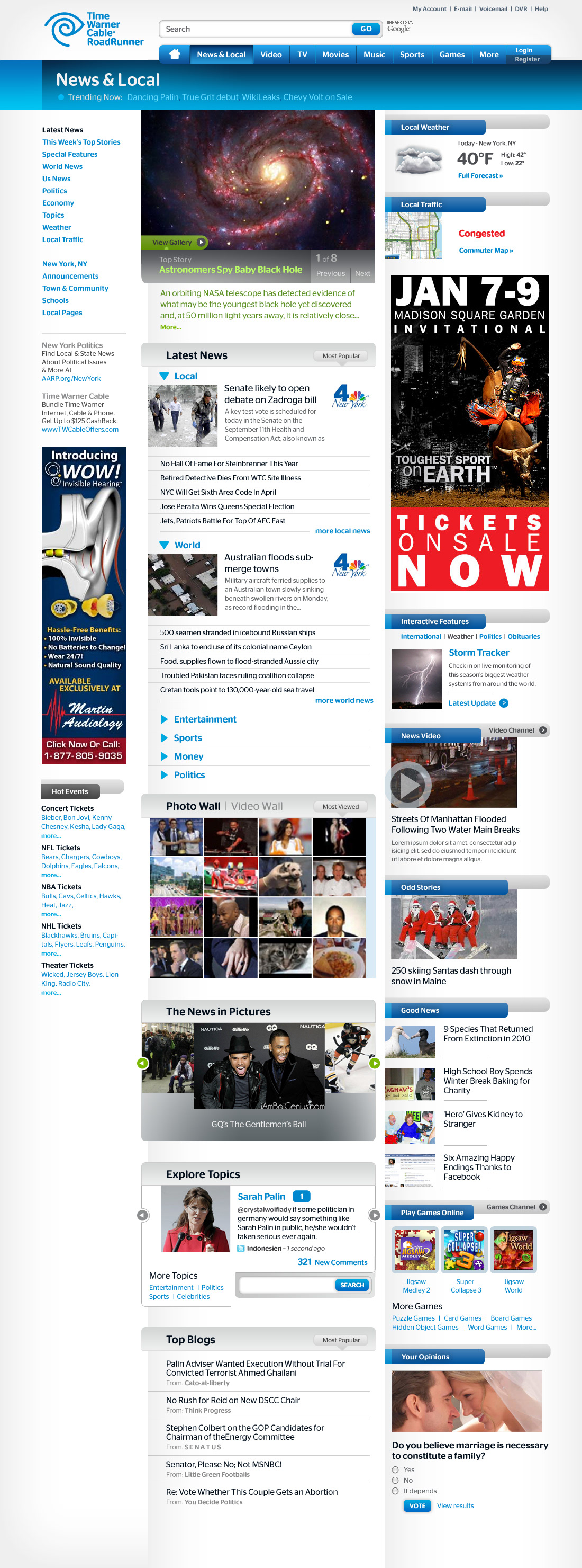
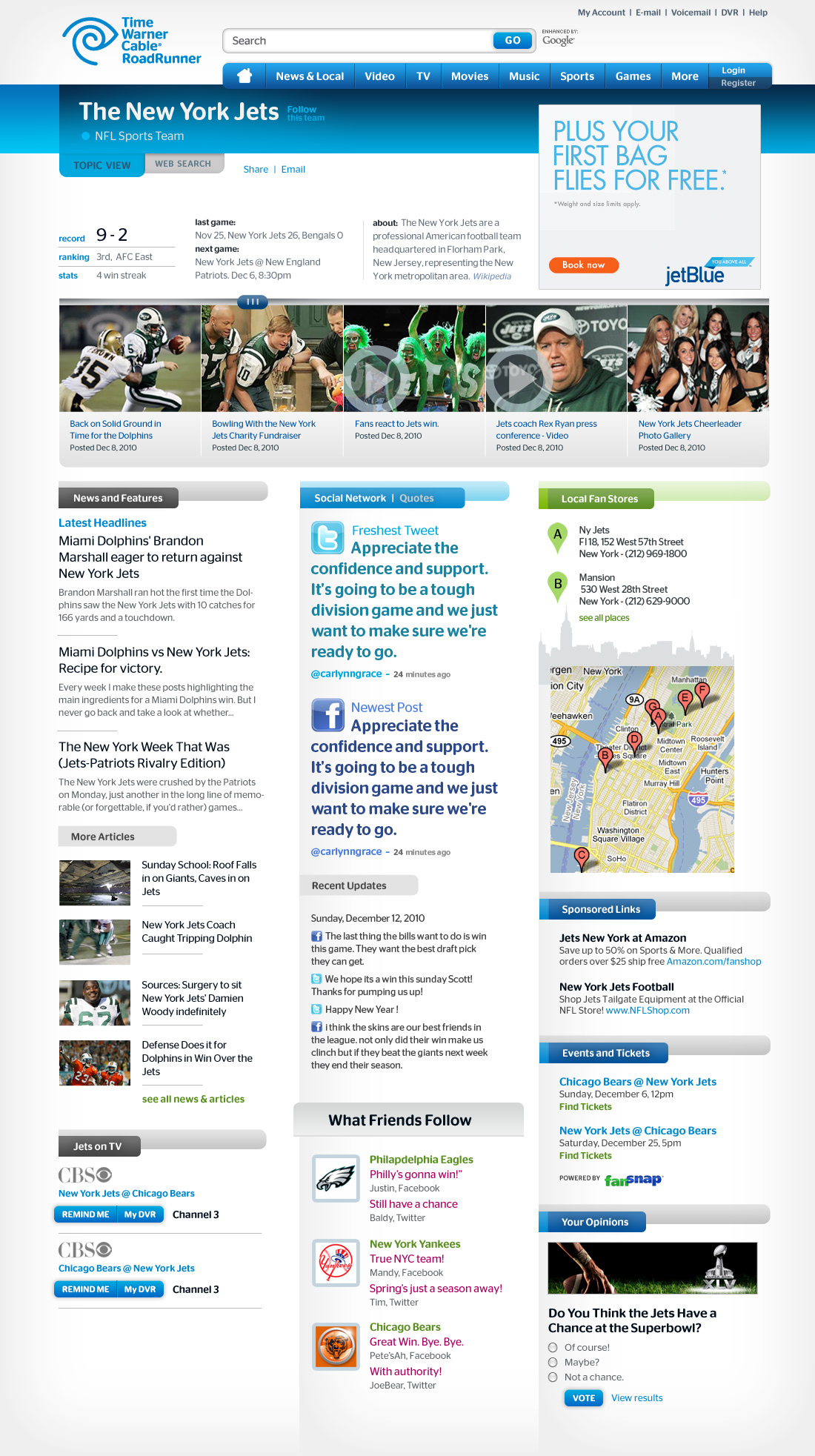
Time Warner was investigating a new, content-rich approach to its popular portal. Once we defined and prioritized the matrix of content groups, blocks and widgets, we gave it a streamlined look. For content delineation we wanted to stay away from boxes for a change, and decided to put the focus on typography. In the end, TWC received a set of templates that's friendly, accessible and content-rich.


